
THE ASK
Create an easy online event platform aimed at reducing an organizer’s costs upfront.

WHO USES COMMIT

Alex, a second-year MBA student and power organizer who wanted to plan an event with Commit. The upfront costs frustrated Alex because she was using her own money to bring people together. It was up to her to figure out the expenses, collect payments and acquire enough money and resources to cover the event.

WORKING AT DESIGNATION
When we received the research conducted by a previous UX team at Designation, we synthesized their research findings and then investigated the problem space further. We wanted to understand how to solve these three frustrations:
- How to figure out a payment system staying within the Commit platform
- Why organizers spend extra time and energy planning an event
- What patterns we could integrate to make this a seamless process


We wanted to understand the branding and the original story behind Commit. Currently, the brand is pink and white. The founder Mia loves a particular shade of lipstick that’s bright pink. She wanted that shade of pink to be associated as Commit’s official color, but it felt overly feminine. Since this is a platform used by everyone we encouraged Mia to be open to adding to her current color palette or even change it all together.


THE STRATEGY

As we sat down to reflect on our initial meeting with Mia, my team compared notes. We took these asks from our client and applied them to our designs:
- How to reinvent pink in the brand identity
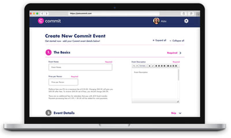
- Use simple cards with enough information for the user
- Test navy with users
- To keep it clean, fun and professional
OUR GUIDING PRINCIPLES

With every iteration, I designed with these principles in mind. The color combination of pink and navy felt right on brand and gave it a distinctive and approachable quality. I used familiar design patterns to radiate credibility to ensure our users a comfortable and familiar system to create an event across multiple platforms.

USER TESTING
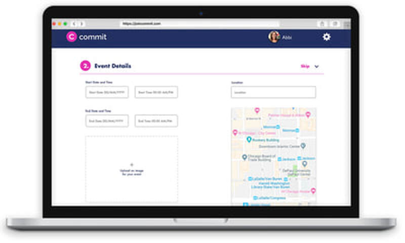
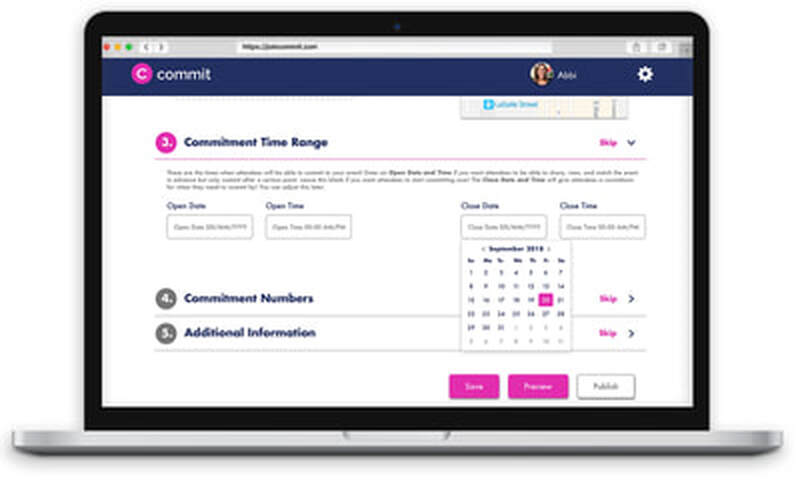
- Rework the calendar.
- Reviewing the wireframes, we noticed there were many steps to choose a date. Currently, the platform had two separate calendars to pick start and end dates and times. It created a lot of confusion, and I wanted to create a simpler system.
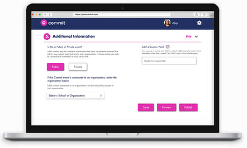
- Condense the footer.
- Inspired by the wireframes, I created a footer that took up a large amount of real estate. Here was an opportunity to redesign the hierarchy of each screen to balance the white space and the information needed to plan an event.
- Change the flow.
- I decided I needed to revisit similar event planning platforms such as Eventbrite and Airbnb to understand a more recognizable design pattern before I created new screens for testing.


FINAL DESIGNS
With only three weeks time, several iterations and multiple rounds of testing we presented our final designs to Mia and the Commit team. I was especially delighted to speak to Mia about some of the insights from my designs. The navy and Commit pink combination was a win; the navy complimented the pink and gave an extra level of color to the brand's identity. Users thought the flow was easy to digest and recognized patterns and actions based on platforms they currently used. The updated calendar system was cohesive; however, it still wasn’t a familiar pattern and needed more research and testing.


AFTER DESIGNATION
Our scheduled work with Commit ended with our client not knowing which design to adopt. But within a few weeks, Mia had approached me and stated that my hard work and designs had resonated with her and she wanted me to implement my designs for Commit. She also brought on board Mary Heer, a UX designer who had worked with Mia on the first, UX-centered-phase of the project at Designation. She would spend several weeks working with Mia. She continued to research design patterns, create wireframes, and begin to build high-fidelity screens. After I graduated from the program, I would partner up with Mary and continue to develop additional screens. During our first meeting, she communicated the overall structure and what was needed to complete the project. We made improvements for both mobile and desktop to ensure a comfortable experience for the organizer

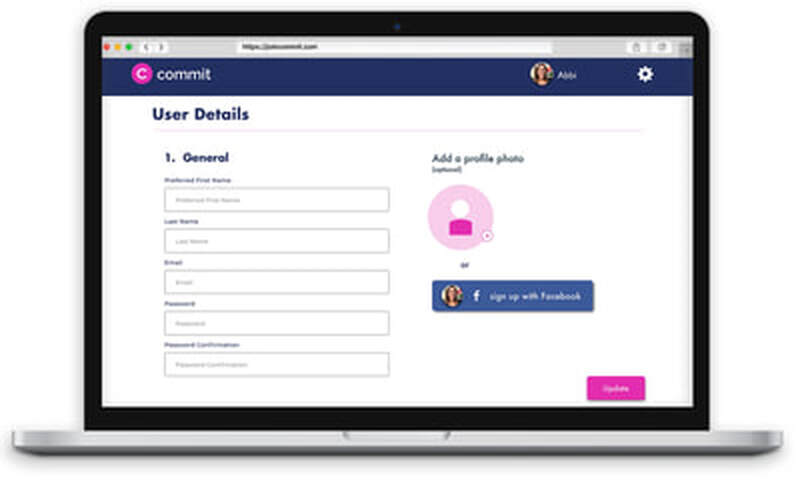
With the new redesign, we were able to keep the platform approachable by keeping it honest and inviting. The users had the ability to upload their images which kept the designs informal and created a genuine connection.


We spent many hours synthesizing and researching to align and make our designs strong. We came together to find ways that we could utilize our testing and research to provide Commit with the best designs possible. It was important to us to use this additional work to improve the organizer's experience too; we were able to organize the site layout in ways that addressed organizers' event planning frustrations. When we presented our final designs to Mia, she smiled and whispered, "This is looking like my dreams."


WHAT I LEARNED
I found it essential to work directly with a UX designer. Mary was terrific at providing great ideas and continuing research while I moved forward with the designs. Our work together allowed me to stretch my understanding of various patterns and expand on the available real estate. Since we were both recent Designation graduates, we realized the importance of building a great foundation of communication and collaboration. Our partnership helped me gain knowledge and experience I’ll be able to use in the future.